Goal: To create a professional, clean, simple stationery package for a new development in South Austin
Client: The new development is called Rosemark Glen. It will be 15 high-end / well-built rental duplexes.
Style: High quality, High end without the snob factor, Solid, Attention to detail, Concierge, Warm, Relaxed and calm
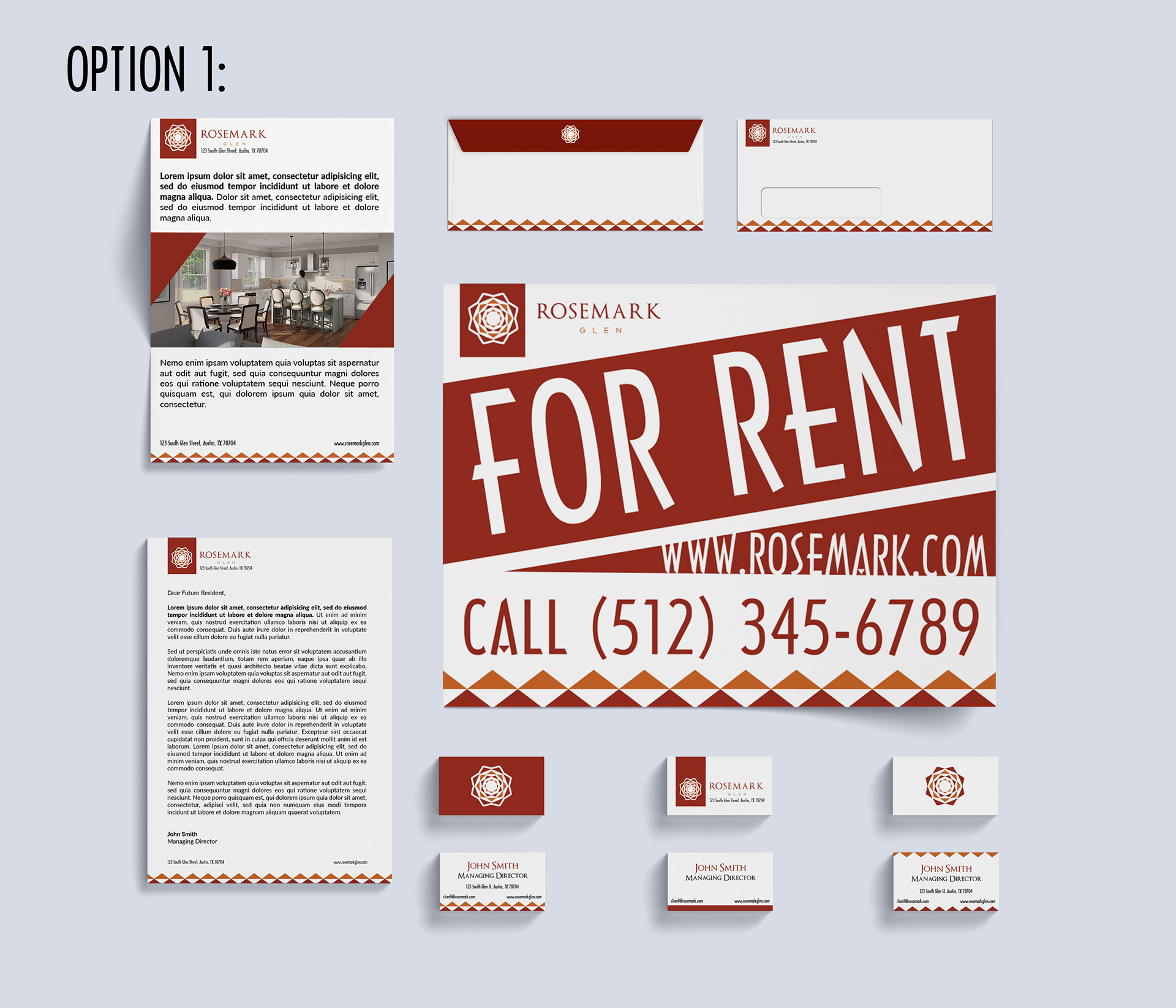
Option 1:
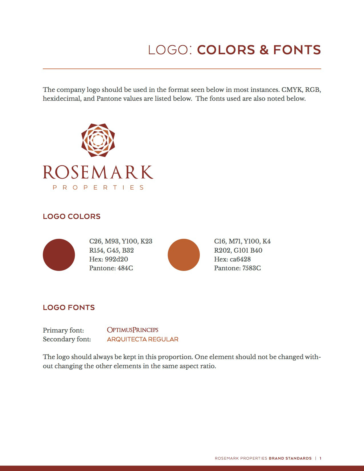
In noting the colors and style of the pre-determined logo, I opted for a warm and creative way to incorporate the style of the company into the entire stationery set.
The envelope (back and front) is simple but still colorful and festive enough to not make it seem like it's just a car insurance bill. The logo and company name are all in accordance with the brand guidelines but with a slight shift to the right instead of all stacked upon each other. While the original logo is great for certain utilities, having a right justified logo in addition makes sense for a company style guide.
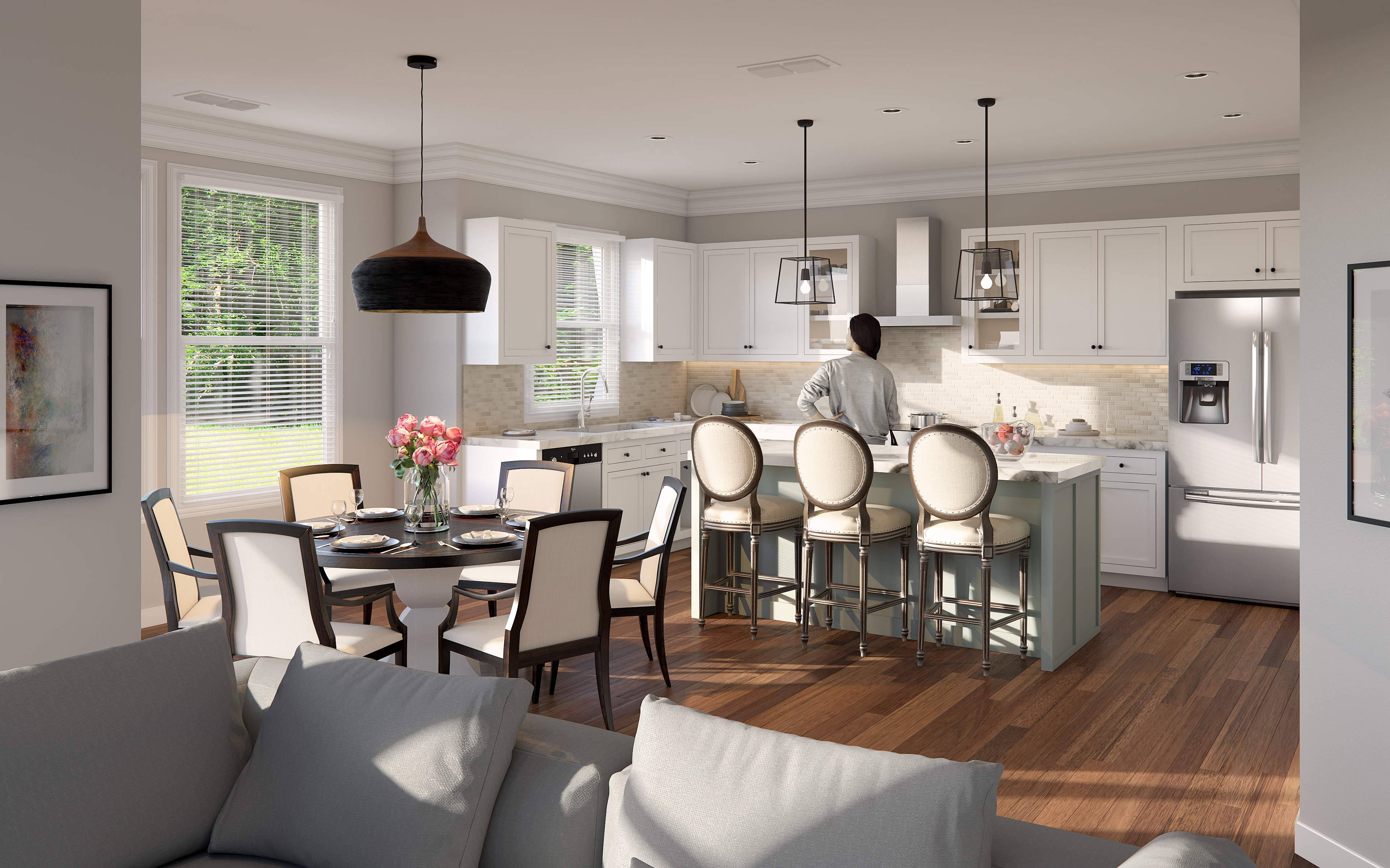
Each element of the stationery package is consistent with one another, promoting a professional look without the snob factor, as noted in the client brief. I also included an example leaflet as it would normally be included in a stationery set and provided the perfect outlet to show the renderings as well as some interesting tidbits on the housing available, similar to a brochure.
There are a number of options for the business cards, depending on whether the client prefers more of a modern look or more of a business professional style. It would also be possible for the company to choose more than one of the business card designs depending on the title and position within the company or personal preference.
The yard sign (18x24) includes the company name, number, website, and "FOR RENT" in accordance with the rest of the set. The triangle border is carried through each object in the set and helps offset the use of the red/maroon in the sign. The importance of the triangle in this set (especially in the logo) can be seen in the shapes cut in the sign itself but used in such a way that they don't seem cliche or overused.
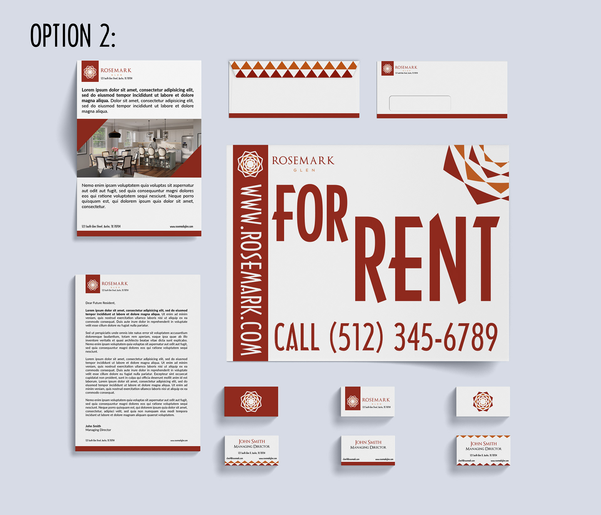
Option 2:
In this style set, the triangles are not as highly emphasized but only incorporated subtlety as a pop of color, as can be seen in the envelope flap. Instead a single red/maroon line is used as a border which gives off a very polished, professional, and 'solid' style. This line even carries through to the yard sign except the line is flipped vertically. The logo itself acts as a large decorative aspect to the sign, adding a pop of color and filling in white space.
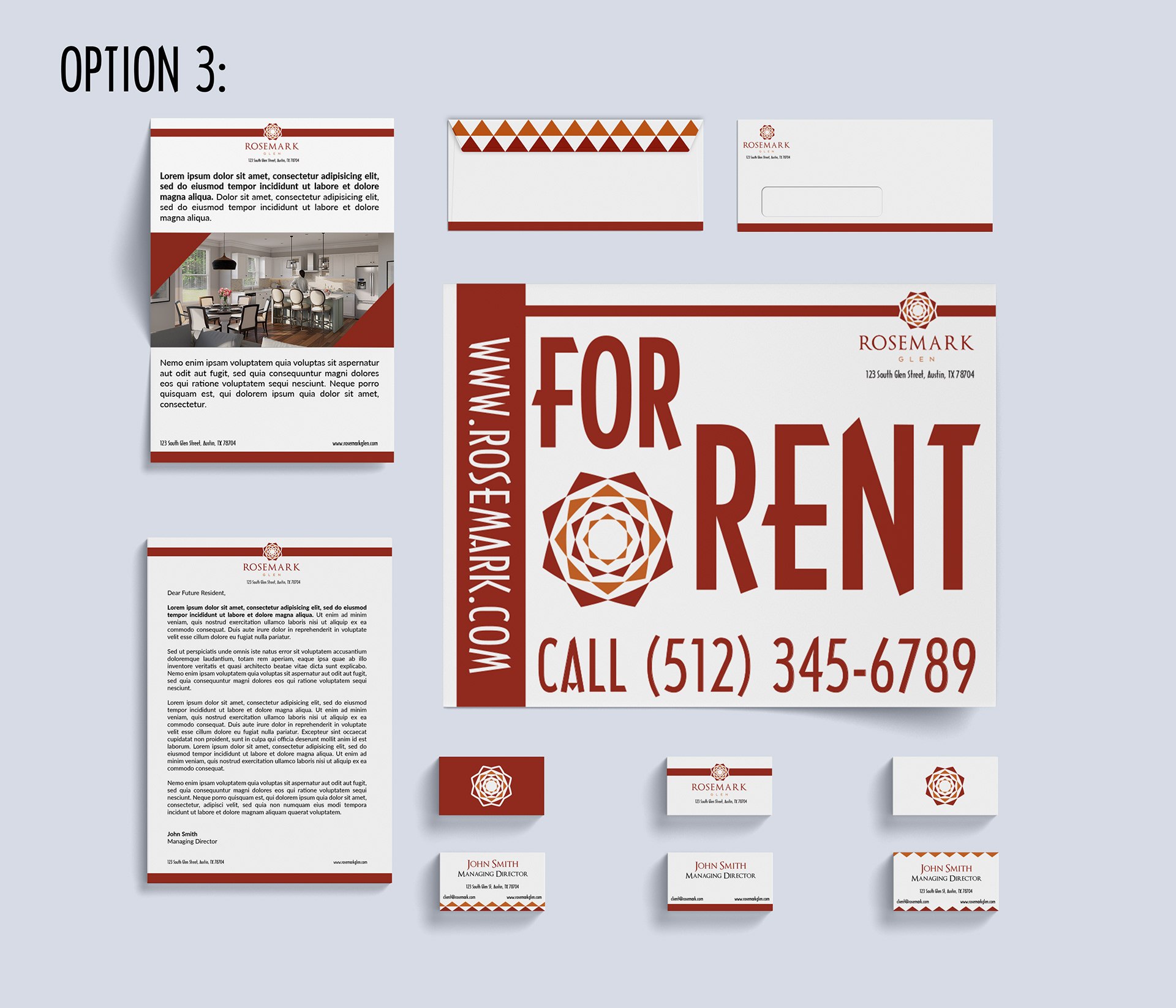
Option 3:
Option 3 uses the stacked logo in the style guide but still incorporates the various stripes and triangles seen in previous options. It goes to show that regardless of the orientation of the logo, the style prevails but just in case, I wanted to illustrate all possible iterations of the logo type. This option, using the stacked logo, actually further reiterates the use of the solid red/maroon stripe as a means of "breaking up" the logo from the surrounding white space while still giving it a very professional look.
Each different option style can be intermixed amongst each other. For example, the letterhead in option 1 can be placed in the envelope for option 2 without concern. It gives the company some variety and perhaps a different use for each different style.
For the font, I used Arcquiecta Regular, OptimusPrincipes, and Lato for the filler text in the letter and leaflet.